Implementing the Dashboard Monitoring onto Moka POS mobile version — a UX Case Study

Overview
Some Point of Sales in Indonesia still adopt a conventional process of monitoring and controlling income which only can do it on web version. This problem is urgent because many business owners feel difficult in monitoring and controlling their business income if he was not in his office and couldn’t access desktop. At certain time, this problem will cause snowball effect economics in unaware micro expenditure.
The research was done using Food & Beverage business field. We found there are some limitation in using POS mobile apps that needs to monitor sales and cash flow. There are many existing POS (Pawoon, Dealpos, Gobiz, Larispos, etc) where also have a huge number of user.

Meanwhile Dashboard Monitoring feature is only available on Tablet or Desktop while for mobile is unavailable. So we help to create Dashboard Monitoring design in Moka pos mobile device where user can access monitoring every time and everywhere easily and analyse sales in the simple way.
Project Goal
The goal of this study is to help business owners can monitor sales their outlet instantly in one hand.
“How might we’s”
- How might we make dashboard monitoring in Moka POS mobile version to help user can access monitoring everywhere and every time?
- How might we make this more seamless experience and easy to read by user so user can easily analyse their sales?
Design Thinking
Using the design thinking method, we want to define who the target user, what is their needs, and the insights that will be processed into creating a solution. We are confident that the design thinking method will help us to create a solution that meets the three elements, which are feasibility, desirability, and viability. There are five stages of design thinking such as Empathise, Define, Ideate, Prototype and Test.
My role and team:
I primarily worked on Interaction/Visual Design and UX Strategy teaming with Firman who are expert in UX Research.
—
Empathise
We did a research process to get a better understanding about what the user really need in hope we can come up with the right solutions. The research method that we use are in-depth interview (mixed with guerilla research).
Research Topic
First, we set the research topic. We start from analysed the habit of business owners who monitoring and manage their cash flow with Moka POS. After that, we got the information about how is the existing process of monitor and manage their cash flow.
How do business owners monitor Dashboard process currently in Moka POS?
- Open and Turn on the laptop or PC.
- Open the Browser.
- Visit https://backoffice.mokapos.com/.
- Register and Log in Back office Moka POS.
- Click the Outlet filter to select the outlet they want to see.
- Click Calendar to select the date range that that want to see.
Potential User Interview
For the research, we interviewed 5 user, 3 business owner and 2 cashiers.
- Business owner who uses Moka POS on their business, has many outlets, and mobile activity.
- Someone who is also a business owner and cashier at the same time.
In in-depth interview, we ask several questions such as:
- How was your experience using POS on a smartphone?
- What obstacles did you encounter while using the POS for your business activity?
- What do you think about dashboard monitoring in POS currently?
- What do you expect for the POS that you use?
Define
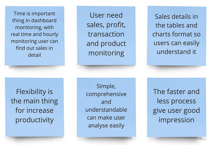
After doing in-depth interview, we conducted an affinity map to help us synthesize the interview data.
Affinity Map

Synthesis
After the affinity map, we tried to conclude the result in some great ideas. This is done to make it easier for us to understand the needs of participants.
User Persona
We make a user persona to give an illustration about our user. In this user persona, we provide an information about user name, goals, frustration, story, and personality. To get a better understanding, we provide some visualization below:

Ideate
Based on the results of research synthesis from in-depth interview and comparative analysis, we generate some ideas for this case study. After that we come up with concept which help user can access dashboard monitoring everywhere and every time on their mobile phone and make this more seamless experience and easy to read by user so user can easily analyse their sales.
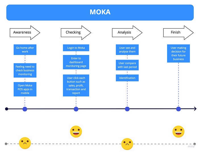
User Journey
In this section, we display the user journey map. In this user journey map, we include the information about user’s persona, the goals the user want to achieve, problems of the user that want to be solve in this application, the scenario of the user situation, the user’s journey while using this application, and the user’s emotion while using the application. In detail, we provide some visualization of it below:
Design Principles
After the research process, we got the insight of the user needs. Based on the data, we come up with the idea of the following design principles, they are:
1. Clean
Our visual style is clean and understandable, to create an easy-to-use application and minimalize error for the new users. Clean is the not the easiest approach to visual style. To the contrary, margins and type scale, washes and colour become more important as we reduce the number of styles we rely on.
2. Consistent
We invest our time wisely, by embracing patterns, recognizing that our usability is greatly improved when similar parts are expressed in similar ways.
3. Useful
Our product is more utility than entertainment, meant for repeated daily use, providing value efficiently. This is why our core interactions, the ones users engage daily, are streamlined, purged of unnecessary clicks and wasted space.
4. Fast
We value our users time more than our own. We know faster experiences are more efficient and feel more effortless. As such, site performance is something our users should never notice. Our app should move as fast as we do.
Prototype
The next is the prototype phase, before enter the HiFi prototype, we do brainstorming by making some sketches to the prototype we make.
Sketch

HiFi Prototype
Design Decisions — Implementing the Dashboard Monitoring onto Moka POS mobile version.
Dashboard Monitoring
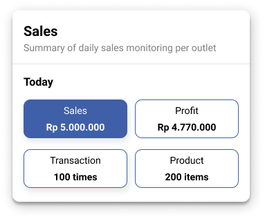
Dashboard monitoring in application design that we make become the homepage. In the dashboard, we disclose change outlet bar, summary, trend/structure, and last record overview. The summary is disclosed in the top section so that the users can scan the information easily.
Besides displaying information, summary also become button, if user tap sales so dashboard monitoring will display sales detail, and if user tap product so dashboard will display product detail and so are the others.

—
According Law of Proximity “Objects that are near, or proximate to each other, tend to be grouped together.”
We divided dashboard monitoring into big three section or cards so user can scan and read easily.

Summary
Based on research, user want a simple dashboard and important information that display on the dashboard such as sales, profit, transaction and product. So in summary we disclose the information summary such as sales amount, profit amount, the number of transactions, and the number of products sold.
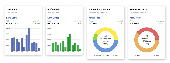
Trend/Structure
We present trend in bar chart form and structure in donut chart form. For sales and profit in the bar chart form because user need to know sales and profit trend hourly, while for transaction and product in the donut chart form because user just want to know comparison of each transaction and product.
In this card we also display percentage ratio with last period, wether plus or minus.
Last Record Overview
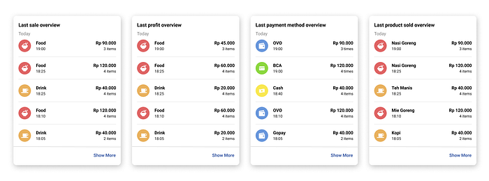
In the last record overview we display last record sales, profit, transaction and product. And the bottom user can tap show more to see all of last record overview.
—
Dashboard — Sales and Profit
In the dashboard-sales and profit we present sales and profit trend in the form of bar chart. We choose bar chart to help user to check the sales trend in every hour easily. So, user or owner can find out when the best time or peak hour on daily and can be better prepared when during peak hour.
Beside that, bar chart also easy to tap compared line chart to see sales and profit detail. Below the bar chart, we disclose the last sale or profit review.

Dashboard — Transaction
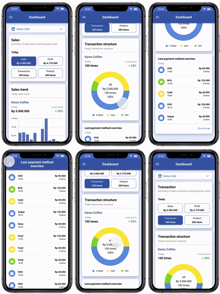
In this dashboard, we disclose the transactions detail in the form of donut chart to make user easier to observe the comparison of transactions and best method payment.
For transaction, we display number of transaction and method payment that used by consumer. This is important for user or owner because with that information they can make discount campaign with the method payment such as Ovo, Gopay, Dana and other.
As same as the sales and profit dashboard, we also display the last method payment that consumer used.
Dashboard — Product
As same as transaction, in product we also disclose the product detail in the form of donut chart to make user easier to observe the comparison of each product. So user find out the best selling product.

Usability Testing
After we done with the prototype, we do a usability testing in order to get feedback about prototype. This usability test we make three random people as our participants to find out the extent to which these features and content are user friendly and easy to use. Doing usability test, we give several task to the user.
User Feedback
Flow and usability
- Based on the research and test concluded, the flow and usability are quite clear for use. The application can be used as an alternative to doing monitor and analyse sales, profit, transaction and product their outlet.
Content
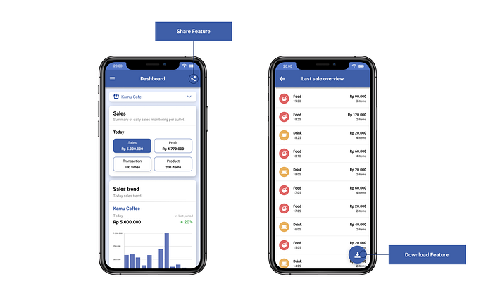
- The dashboard monitoring page can be shared to public deliver such as investor, company partner and stakeholder. So it can help owner to present their financial summary if they want to find new investor.
- Participant requested download feature in last record overview.
Iteration
After usability testing, we did iteration but it is just minor iteration because we just add share feature and download feature. Flow and usability are clear for use so we didn’t iteration for flow and usability.
Following the final prototype design after iteration

Click here for full prototyping.
Conclusion
The goal of this study is to help business owners can monitor sales their outlet instantly in one hand so we implementing Dashboard Monitoring onto Mobile version.
Throughout the process, we realised that what we do is far from being perfect.
Thus, we know what to do in the future:
- Research about other feature such as report, inventory, employee, and other
- More research about finance and accounting.
- And more usability testing.
Tools
Last but not least, we use some tools that accommodate the whole study process.

Figma: to create the design system and prototypes.
Miro: used to collaborate and gathering all of the ideas.
Slack: used to communicate along with the member
Notion: organizing project work in collaboration and described the job description of each member in the team and also for task scheduling based on Design Thinking and scrum process.
Draw.io: used to make an user flow, Information Architecture Diagram, and Customer Journey Map
I hope you learned something as well. If you enjoyed reading this article, please leave and any feedback on the comment section. Thank you.
